Designing Yieldo: A Calmer Way to Invest
Designing an AI-powered wealth management platform that replaces trading noise with transparent reporting and disciplined strategy.

Client:
Yieldo
Category:
Fintech · Brand Systems · Product Design
My Role:
Product & Brand Designer
Yieldo is an investment research and portfolio platform designed to give self-directed investors a clearer view of their money and performance.
For Yieldo, I established the brand and visual foundation, then applied it across the marketing site and core product experiences, from portfolio dashboards and performance reporting to holdings, transactions, and account flows.
THE CHALLENGE
Creating clarity without simplifying the substance
Yieldo is built for financially literate, self-directed investors who want depth without unnecessary complexity. The challenge was to create a visual language that could support serious financial data while still feeling modern, approachable, and easy to navigate.
THE APPROACH
Design Approach
01 — Brand Foundation
Defined the audience, positioning, voice, and core attributes that would guide the experience.
02 — Visual System
Established typography, color, spacing, surfaces, interaction patterns, and data presentation.
03 — Product Application
Applied the system across marketing, authentication, dashboards, performance, holdings, and transactions.
MARKETING EXPERIENCE
Building a clear first impression
The marketing experience introduces Yieldo through a clear hierarchy of positioning, product proof, features, pricing, and conversion. The visual language stays closely connected to the product itself, using real interface elements and financial data to communicate value.

Homepage
A product-led marketing experience built around clear hierarchy, restrained visual emphasis, and real financial data.


Sign In
Consistent forms and interaction patterns extend the visual language into account access.
Sign Up
Account creation uses the same typography, surfaces, controls, and action hierarchy as the broader product.
PRODUCT EXPERIENCE
Designing for information density
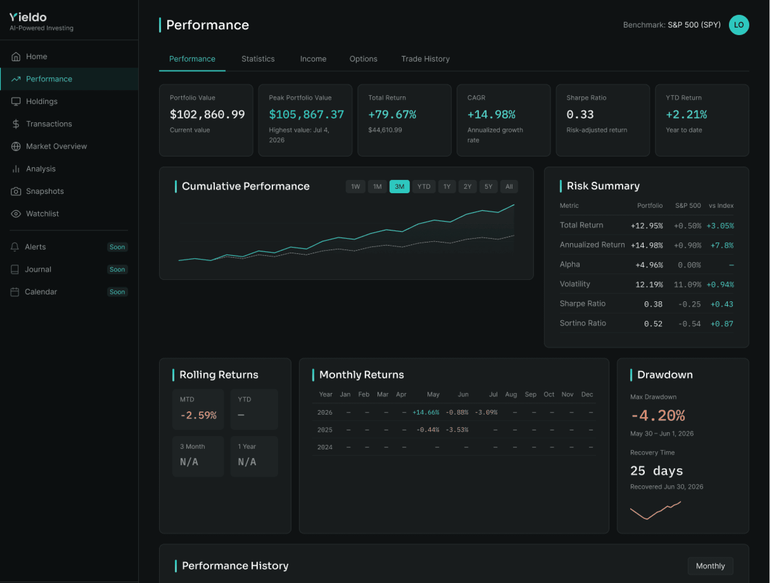
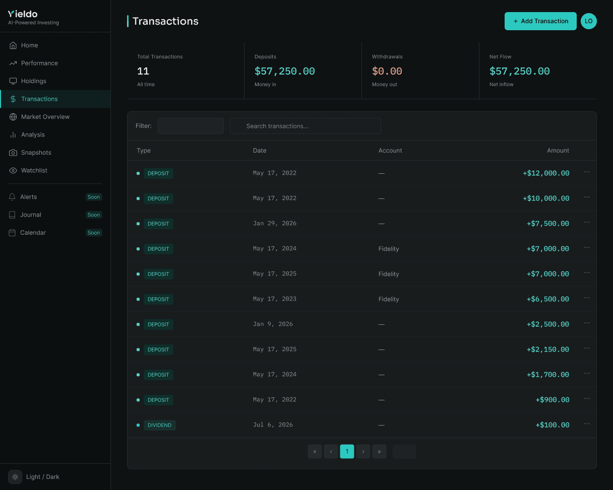
Inside the product, the challenge shifts from storytelling to financial complexity. I used consistent surfaces, semantic color, typography, spacing, and repeatable data patterns to keep dense portfolio information readable and cohesive.


Dashboard
Portfolio health, allocation, exposure, benchmarks, and holdings at a glance.
Performance
Returns, benchmarks, risk metrics, and historical performance organized into a structured view.
Holdings
Dense portfolio data organized for comparison, scanning, and analysis.
Transactions
Shared table, filtering, and action patterns extended across account activity.
DESIGN SYSTEM
Building the Design System
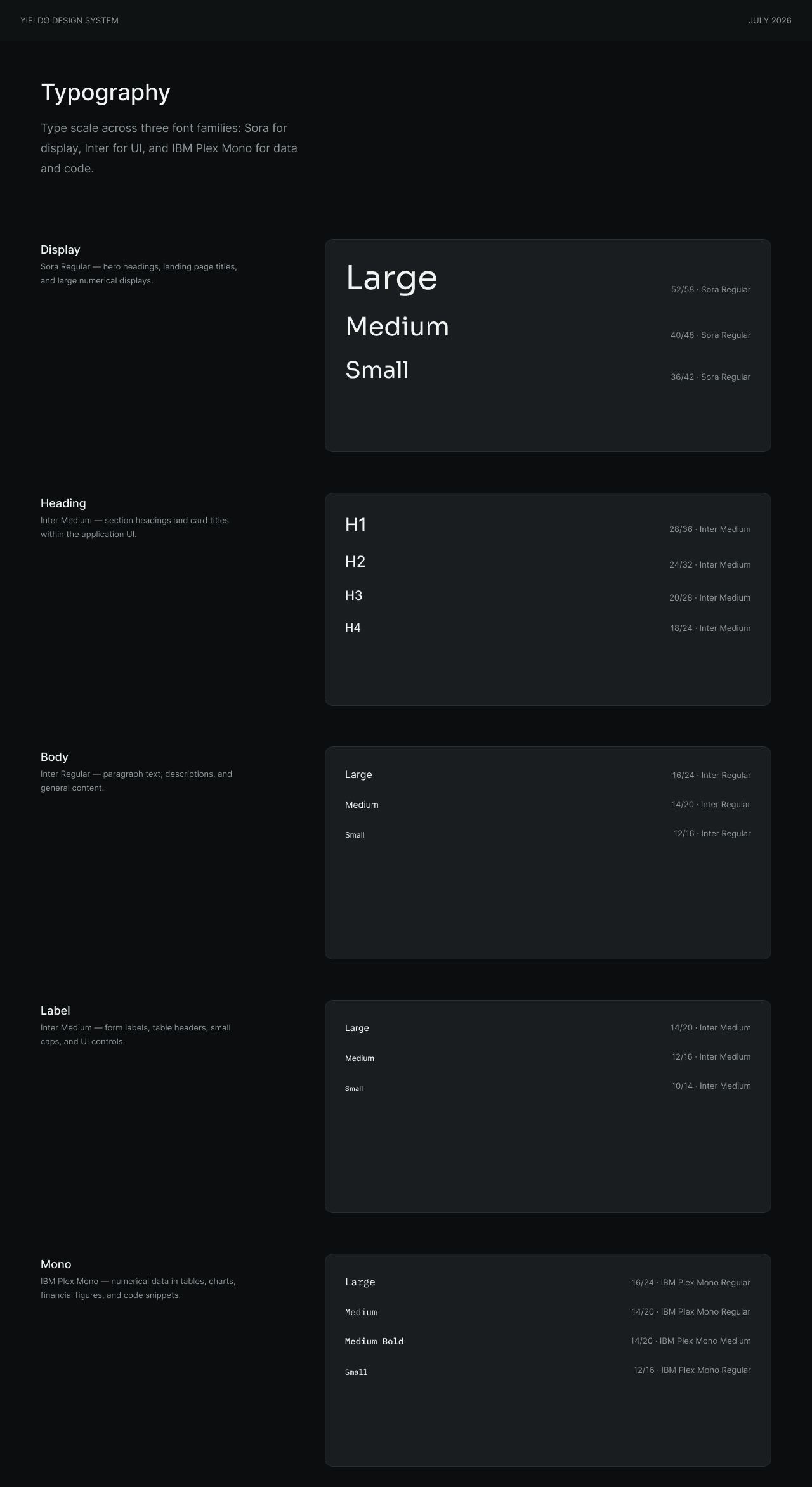
Rather than treating each screen as a separate design problem, I documented the visual language as a reusable system covering typography, color, spacing, grids, navigation, forms, cards, data treatments, interaction states, and light and dark themes.
One shared foundation across brand, marketing, and product.


REFLECTION
Designing with Discipline
Yieldo reinforced that clarity in financial products does not require removing complexity. The deeper challenge is deciding how that complexity should be organized and communicated. By giving color, typography, spacing, surfaces, and data clear roles, the experience could remain substantive while still feeling calm and intentional.
Related Projects

